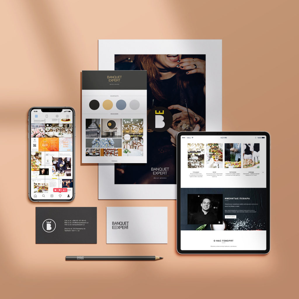
Building a brand identity from the ground up for an event company specializing in corporate banquets organization. Our task was to find a name that talks about the product, and sound identically in the main target languages: English, Russian and Uzbek.
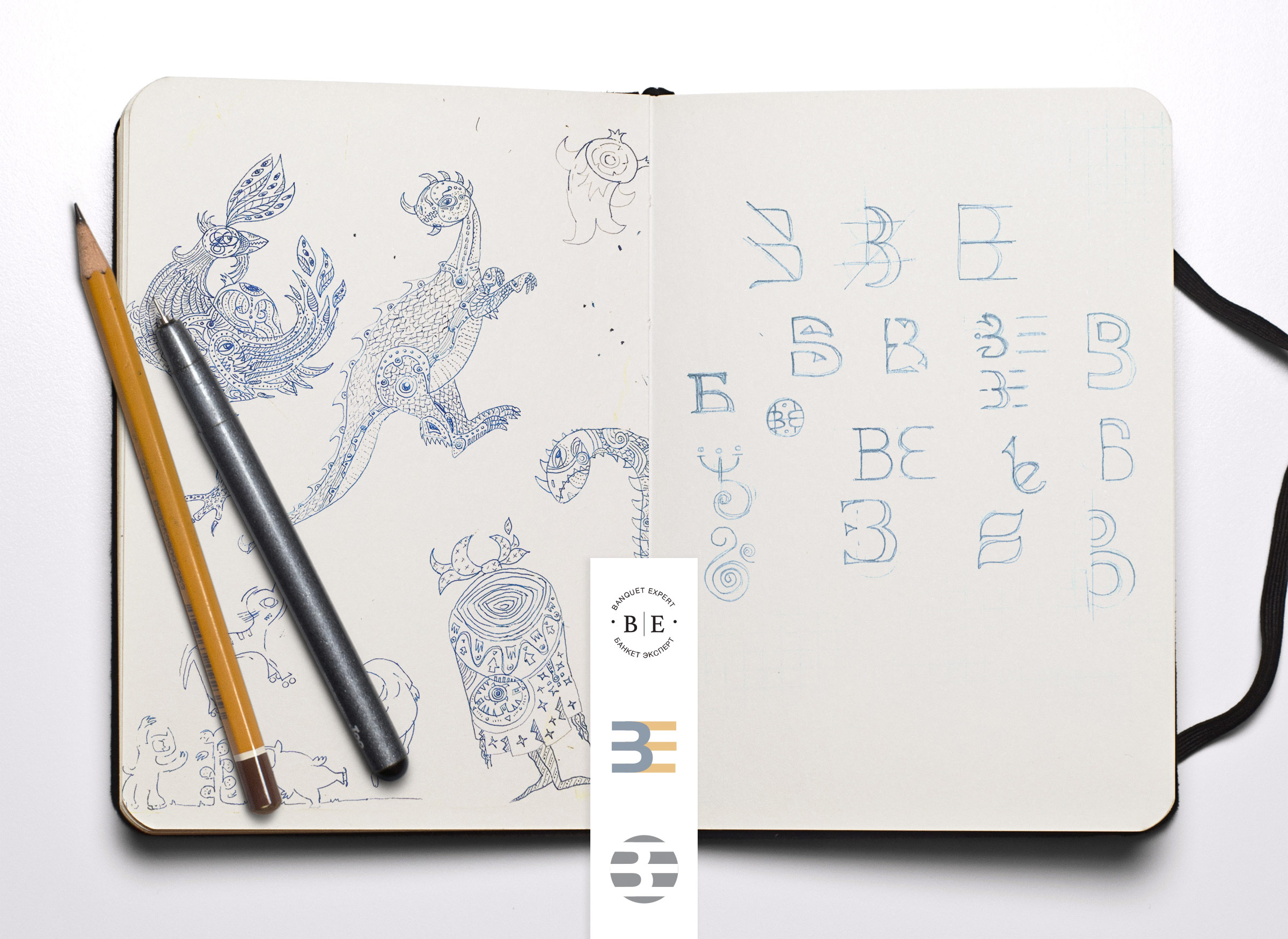
The logomark represents an abbreviation “BE” which stands for Banquet Expert, where “E” is placed over the “B” forming a crown. Our services included formulating brand guidelines for design, style and tone, creating a WordPress website and social media branding.
Scope
- Naming
- Brand image
- Print & digital
- WordPress Website
- Social media branding
- SEO & SMM


“Какое счастье , когда твои задумки и идеи твоего проекта могут идеально упаковать и донести до потребителя. Огромная благодарность команде Design!ca за осуществление самых смелых идей!”
Sadokat S.
CEO, Banquet Expert
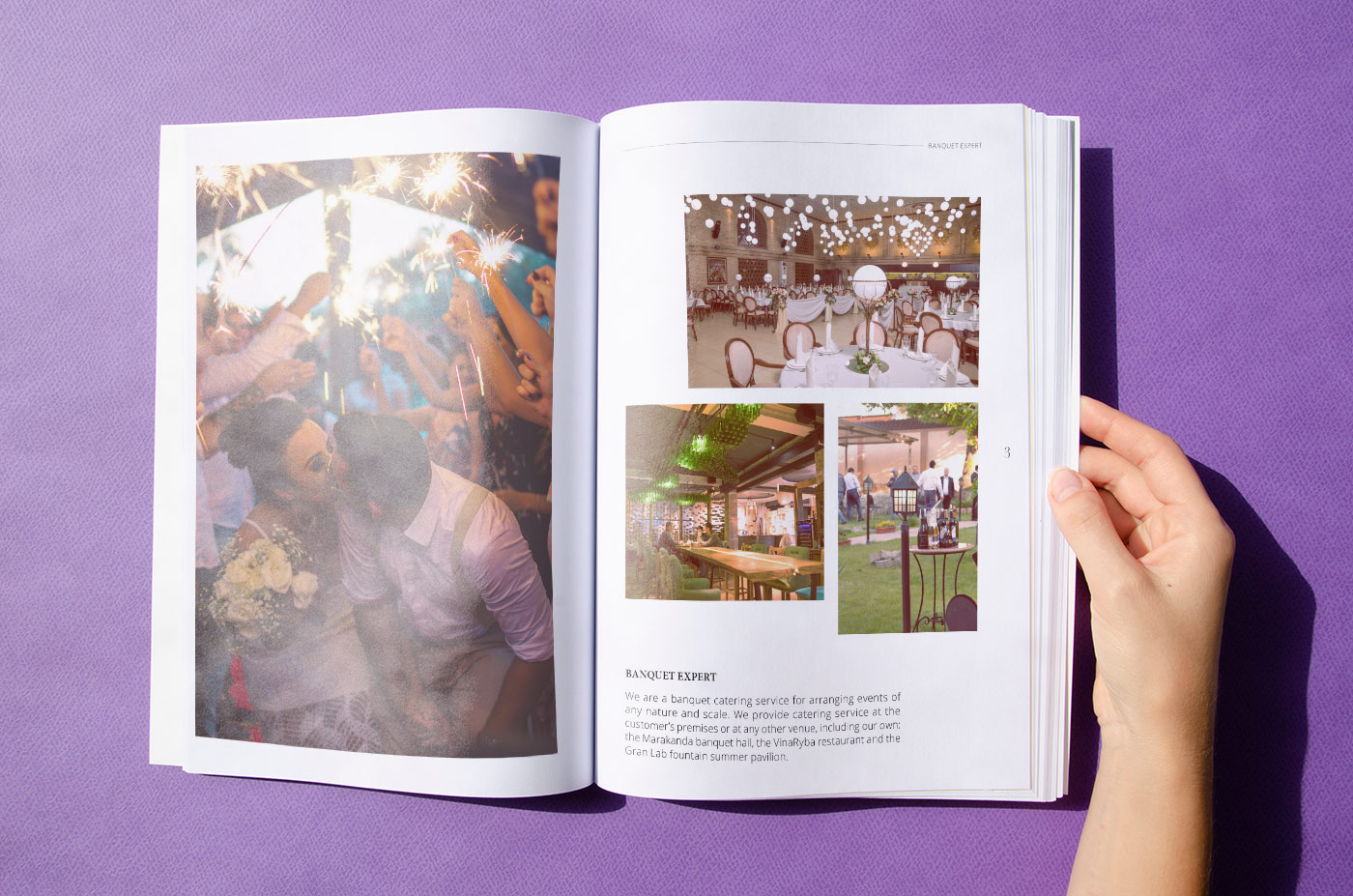
The union of three successful brands — the threefold strength!
After trying different motifs we decided to play with the abbreviation “BE” which stands for Banquet Expert. We found that the “BE” symbol might be a good concept as it would work well in call to actions, like: “BE happy” or “Let it BE”.
We also tried to make the letter B look like number 3 since there are three founders / brands who have formed the new company and this fact is reflected in the philosophy of the brand.
137
Increase in overall sales
218
Sales during the ad campaign
162
Positive reviews written